Editing Fashion Photos

IMG_1609.JPG

For this portrait shot, I made sure to include the model’s full body to be able to show her fashion choices, and also to allow the viewer to see that the photo is taken from a low angle. This low angle adds to the model’s attitude and shows that she has superiority. Her facial expression is neutral, meaning that the viewer has to figure out, by using reception theory and deciphering the semiotics of the shot’s angles, and colours used, how she is feeling and what impression she is giving off. As I talked about in my blog about semiotics, colours can give the viewer different impressions and ideas regarding the subject. In this shot, her face is in the red light, suggesting that out of the blue and red (possibly representing light and dark), she favours the dark.

Image result for labour and conservative

Image result for red and blue star wars

I chose to use the red and blue colours for this shot because, traditionally in media, there are two apposing sides to many stories: the two main political parties in both the UK and the USA use the colours red or blue, and the good and bad side of stories in pop culture often use red and blue. These contrasting colours are used to show two sides of conflict and arguments, which I wanted to see shown through my photography. The lights show how there is conflict in my model. Using a shade of dark red on the model’s face shows that she is possibly favouring the darker side of her inner-conflict, which gives a menacing and intimidating feel: working alongside the low camera angle used in this shot.

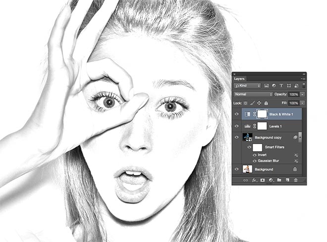
For this photo, I wanted to do something different and more creative with the editing. I decided to take inspiration from the electronic duo Disclosure, who often feature a simple but effective editing technique in a lot of their promotional work. Essentially, I wanted to do a simpler version of this, where I would outline my model’s facial features. I chose this specific photograph because it’s quite dark, so I think using the white to outline the facial features works best here: it means that the user can see exactly where her facial details are.

Image result for disclosure

The outline also gives an anonymous and mysterious feel to the subject because it covers part of her face, which is reinforced by the already dark image. To achieve this look, I simply chose the brush tool, altered the size and chose a brush that looked similar to the one that Disclosure use in their work. I then drew around the outline of the subject’s head, eyes, nose and mouth. Choosing the right size brush was important to make sure that it was visible but not too big so that it would get in the way of the face.

Screen Shot 2019-06-11 at 15.26.13.png

For this photo, I altered the hue (the original is on the left and the edit on the right). I like this edit because it has completely changed the shade of yellow that has been used, and gives a different impression of the model. The hue has become much warmer and, consequently, so has the model. The original yellow was quite bright and harsh, especially when compared to the very dark blue.

Below is a link to my new fashion photos:

https://drive.google.com/open?id=1wW6Hj1iFBOCRLAlkLUiYqy9D-7ZKf41g


References

Billboard. (2019). Disclosure’s 15 Best Songs: Critics’ Picks. [online] Available at: https://www.billboard.com/articles/news/dance/7647013/disclosure-songs-best-hits-list [Accessed 11 Jun. 2019].

Fujikawa, J. and Fujikawa, J. (2019). In a Lightsaber Waffle Duel, Everyone Wins | StarWars.com. [online] StarWars.com. Available at: https://www.starwars.com/news/lightsaber-waffle-sticks [Accessed 11 Jun. 2019].

Search Laboratory UK. (2019). Conservative vs. Labour websites – which is more likely to convert voters? | Search Laboratory. [online] Available at: https://www.searchlaboratory.com/2017/06/conservative-vs-labour-websites-which-is-more-likely-to-convert-voters/ [Accessed 11 Jun. 2019].

YouTube. (2019). How to Create Outline Portrait Effect in Photoshop – #Photoshop Tutorials. [online] Available at: https://www.youtube.com/watch?v=oScONltOqAs [Accessed 11 Jun. 2019].


Studio Fashion Photography

For the studio fashion photography, I needed to research some tips for how to shoot in this particular environment. Possibly the biggest difference between shooting in a studio and shooting on-location is the lighting. Natural lighting is often used on-location, whereas for studio photography the lighting is artificial. For my photography, I want to create different coloured lights to show on my subject’s face. I will achieve this by using LED, hand-held lights. In front of these, my two friends will each hold a different coloured gel. These lights will then be directed towards the subject and will have contrasting colours reflected on either side of her face. These will be the only lights being used in the shoot.

I want to show the subject’s fashion choices, so it will be important in the photographs to actually include her outfit and fashion choices.

Working in a studio environment is something I haven’t had much practise in through the two years of this course. Shooting in a studio is very different to being on-location, and certainly brings its own advantages. The photos aren’t dependent on the weather, there’s no involvement with the public and, as mentioned before, lighting can be used in whatever way I desire. All of these advantages will help me and allow me to shoot the photographs in the studio easily.

Shooting in a studio means that I can focus more on factors such as semiotics, especially because I will be experimenting with different coloured lights and seeing what effect they have on the subject. For example, red is the colour of passion, love and anger. I want to experiment and see what, when matched with the models facial expression, effect these colours had on the viewer. In particular, I will match certain colours together that are contrasts, such as red and blue. These two colours are sometimes seen as opposites of each other, so to have both shining on the model’s face will force the viewer to think about her pose, facial expression and fashion choices. If, for example, the model’s face is in the red light, and she has a moody expression on her face, this will give the viewer the impression that she isn’t a friendly and approachable person. On the contrary, if her face is facing the blue and she is smiling, it will give the opposite impression.


References

Hull, C. (2019). The Complete Guide To Fashion Photography: 92 Tips. [online] ExpertPhotography. Available at: https://expertphotography.com/the-complete-guide-to-fashion-photography-tips/ [Accessed 4 Jun. 2019].

Reflecting on my Photography

After discussing and reflecting on my photographs with my teacher, we decided that some weren’t quite to the best of my ability. This included some fashion photos that were slightly soft in areas or just deemed not appropriate for this project.

Due to these technical problems, where photos aren’t quite as good as I had hoped, I have planned another photoshoot. This shoot will be in a studio, because this is something new to me that I want to try and will allow me to focus more on the fashion aspect, which is something that my teacher felt was lacking in some of the above photos.

We also discussed the use of cigarettes in photography, which my teacher ultimately deemed inappropriate because, often, if a photograph is going to be used for official reasons, cigarettes won’t be included.

Furthermore, some of my night time photos also need re-shooting. These are from blurriness, framing or because of problems with the lens. All these issues mean that my photos didn’t come out as planned, and new photos will need to be taken. The hardest part about shooting at night, I found, was keeping the camera completely still while taking the photograph. For night time photography, the shutter speed needs to be at least about 5 seconds, of course depending on the scene, to allow enough light to reach the lens. This means that the camera needs to be held completely still, because any movement will be shown through the final photograph – hence why a tripod is incredibly important for late night photography.

Retro Albert Docks Edit

I wanted to create a retro edit for this particular shot of the Royal Albert Docks because I know it’s a place with a history (dating back to 1839), so this fits the vintage theme of the edit. The image on the left is the original photo, and the image on the right is the retro edit. Similar to my pencil sketch edit, I followed a tutorial to show me how to achieve this vintage effect.

The first and most important instruction was to click on the adjustments layer icon and to select ‘Colour Lookup’. This presented me with a lot of options regarding filters and colour effects that I could apply to my image. I then chose ‘Abstract’ from the three available tabs, and chose the setting Gold-Crimson. This is possibly the most important step because it is what gives the image its main bronze colour and the rest of the steps are simple alterations to this to give it more of a retro feel.

screen-shot-2019-06-19-at-11.16.44.png

To add a “vignette”, I duplicated the background layer and converted the duplicate to a smart object. This, as with the pencil sketch, means that I can make changes and apply filters but none of it is set in stone: I can edit and change these settings in the future. I then went to Filter>Lens Correction to add a vignette and changed the midpoint and amount. This gave the effect of the darker edges round the side of the photograph. Finally, I added a grain effect to the photo by going into Filter>Filter Gallery, where under the ‘Texture’ section I added the ‘Grain’ effect. This then gave me my final edited version of the Albert Docks photo.

Retro Albert Docks.jpg

I like the final edit and outcome of this photograph because it looks very vintage and as though the photo could’ve been taken many decades ago. I think this was the perfect photo to use to do try this effect with because of the history of the site.


References

Staff, C. (2019). Apply a quick vintage look in Photoshop. [online] Creative Bloq. Available at: https://www.creativebloq.com/photoshop/apply-quick-vintage-look-photoshop-10121078 [Accessed 9 May 2019].

Visitliverpool.com. (2019). The Royal Albert Dock – Heritage/Visitor Centre in Liverpool, Liverpool – Visit Liverpool. [online] Available at: https://www.visitliverpool.com/things-to-do/the-royal-albert-dock-p16143 [Accessed 9 May 2019].

Pencil Sketch Edit

To explore some more experimental and different edits for me to do on Photoshop, I googled some tutorials on how to create a pencil sketch edit. I decided a pencil sketch would work well for one of my fashion photos as these are all portrait shots, and often sketches will be of a model or a certain subject for the drawing. Below, on the left, is a simple edit of my photo (cropped and slightly altered contrast/brightness), and on the right is the final pencil sketch edit. I particularly chose this picture because it was a simple portrait shot of my subject with a strong pose and outfit choices, but also with a plain background. A plain background is best to use because often with pencil sketches, there can be a loss of depth of field, but I wanted to keep the final image simple so chose to use something with a plain background.

The tutorial took me through, step-by-step, how to create this effect. I began by creating a new duplicate layer, inverting the image, and then converting this layer to a Smart Object. Because I made the layer a Smart Object, it meant that any filters I applied were considered Smart Filters, meaning that their effects aren’t permanent and instead, they can be fine tuned later on. This is important so that if I don’t like a certain way a filter looks, I can change it at any point in the process if I change my mind.

Screen Shot 2019-06-19 at 09.54.52.png

Inverting the image meant that it didn’t look anything near the final image. However, after applying a black and white adjustment layer, the image started to look more like the final outcome and have that pencil sketch look. The rest of the steps after these were minor changes to make the image look more realistic to a pencil sketch. A step that was important for this image, particularly because I kept adding new layers, was to change the blending mode to multiply. This would make the background transparent and allow the previous layers to also be seen at the same time.

Screen Shot 2019-06-19 at 10.05.09


References

Spoon Graphics. (2019). How To Create a Realistic Pencil Sketch Effect in Photoshop. [online] Available at: https://blog.spoongraphics.co.uk/tutorials/how-to-create-a-realistic-pencil-sketch-effect-in-photoshop [Accessed 6 May. 2019].


Different Editing Techniques

I want to create a couple of edits for my work that are different to the rest. They will allow me to experiment with new editing techniques and learn new skills on Photoshop. My first idea is to create a pencil sketch edit of a photograph. This will look like someone has actually sketched the photo rather than it looking like a photograph. The best theme to do this with is fashion. This is because these shots are, effectively, portrait shots. Of course, a lot of the time, portraits are sketched with a pencil. If I want my edit to look as realistic as possible, then a portrait shot is the best way for me to achieve this.

To actually edit the photo, I will need to follow a tutorial online. This is so that I can see, step-by-step, how to complete the edit and get the final pencil sketch photo. While going through the tutorial, I will pick up and learn new techniques that I will be able to use in future edits.

Image result for pencil sketch photoshop edit

Another edit I want to do is a retro edit. For this, I will again need to find a tutorial to follow online so that I can learn new techniques myself. I wanted to do a retro edit because of the history involved in the Royal Albert Docks. This site was created in the 19th century and has been used, in some form or another, since. Such a historic site is the reason that I decided this would be the best photo to use for my retro photo edit. This edit will make the photograph look as though it was taken using an old camera by using a sepia filter (applied in post-production). This edit will allow me to learn new techniques about how to apply filters and also how to make something more realistic. The edit won’t just apply a retro filter, but also edit the photo to add age to it.


References

Albertdock.com. (2019). History – Royal Albert Dock Liverpool. [online] Available at: https://albertdock.com/history [Accessed 30 Apr. 2019].

Spoon Graphics. (2019). How To Create a Realistic Pencil Sketch Effect in Photoshop. [online] Available at: https://blog.spoongraphics.co.uk/tutorials/how-to-create-a-realistic-pencil-sketch-effect-in-photoshop [Accessed 30 Apr. 2019].

Architecture Theme Technical Skills

Architectural shots, it could be argued, are easier to take. The building, of course, doesn’t move, which makes photographing it easier than most things. This suggests that the main thing to focus on would be the composition and framing. Of course, the camera settings are still important so that the final image will look its best. I found a page named ‘Photographing Buildings Using Your Digital SLR’. This page explains that shooting with an aperture of around f/11-f/16 would be best to create the desired depth of field.

Screen Shot 2019-04-05 at 13.11.47.png

It also suggests having the ISO setting somewhere between 100-400. Of course, all these settings are subject to the conditions and lighting on the day. Playing around with the settings and seeing what gives the best image on the day is the only real way to decide.

For my own photography, and with my practise shots, I focussed on framing and the composition of the photo. This practise shot below shows how I can improve my work. In this shot I decided to shoot in landscape, whereas (in hindsight) it probably would’ve been more appropriate to shoot in portrait. This is because of the long lines leading up through the center of the photo, and the top of the window and the columns that have been cut off.

P1020847 (2).JPG

Even in my practise shots, I wanted to refer back to my original research, particularly regarding leading lines. In this shot, I tried to capture the lines leading up vertically through the shot, leading up parallel to the bright, colourful window. In hindsight, it wasn’t a good idea to shoot this shot landscape, as I couldn’t fully capture the leading lines and didn’t capture the full beauty of the window and cathedral as a whole. Fortunately, this was only a practise shot and I can learn from my mistakes, so for my final shot I will make sure to shoot in portrait for this window shot.

References

dummies. (2019). Photographing Buildings Using Your Digital SLR – dummies. [online] Available at: https://www.dummies.com/photography/digital-photography/shooting/photographing-buildings-using-your-digital-slr/ [Accessed 5 Apr. 2019].

Analysing Existing Night Time Photographs

Image result for light trails photos

In this photo, we can see light trails from cars driving either way along a road. The different lights are caused by the different coloured lights of the cars viewed from the back and front. To achieve this photo, the shutter speed needs to be set to something long, ideally at least 5 seconds. This allows enough light into the lens so that these trails are created. This photo is perfect because of the accompanying backdrop, and the mix of colours that have been captured over the hills. The light trails start from the bottom of the screen, and lead the eye round the corner where they disappear. This allows the viewer to focus not only on the lights, but also the backdrop.

Image result for night time photography

In this photo, there is a city skyline set behind greenery. This is a visible and stark contrast between nature and urban life. With such a large green area so close to a city, it gives an insight into what the future of urban life may look like. This theme of nature is continued on the other side of the urban area, where a large river is situated. I like how this photo shows two contrasting sides of life because this could cause a conversation and get people talking about particular issues – in this case two very different environments.

Image result for night time photography water

The lights reflecting on the water in this image are central to its appeal. The vibrant mix of colours and the way they all cut vertically through the shot are eye-catching. The photographer has chosen to include all of the reflections rather than including more of the skyline, which is a more common way to photograph a city scene. The framing and the view from where the picture is taken from means that even more colours are captured in the image through the sunset on the left of the image.

Analysing Existing Fashion Photographs

Image result for street fashion photography

This photograph is of a model, sat on a stone structure in public. It’s in black and white to allow the viewer to focus on the model’s pose and fashion choices rather than the colours in the image. The black and white keeps it simple, not showing any colour of the model’s outfit and allowing the audience to focus on her attitude, pose and outfit instead. Her makeup is also very effective, as it simple but there is a lot (particularly dark colours) around her eyes. This gives yet more of an attitude to the picture as a whole. Her pose is very important to this picture: the wide stance gives an effect of power, and her hand on her hair suggests carelessness and a nonchalance to her attitude.

Image result for street fashion photography

In this photo, we can see a girl holding her sunglasses and leaning in the middle of the road. The road in the background is out of focus so that it only acts as a backdrop, rather than taking any focus away from the model. Her fashion is important to this shot, as her sunglasses play an important part to her pose and facial expression. I get the impression that this woman has a strong attitude and has a lot of confidence.

Image result for street fashion photography

In this photograph, we see a man peering over his shoulder while fixing his sleeves. The way that he is sorting out his clothing will mean the viewer will focus on what he is doing and, in turn, look at his outfit choice. Similarly with this photo, there is an urban backdrop. This backdrop looks less like a residential area but rather a space beneath a road that isn’t used much. Taking the photo here makes the model look slightly out of place. However, by using a wide aperture, the main focus is still on the model and his fashion.

Analysing Existing Architecture Photographs

Liverpool_architecture_photography.jpg

In this shot you can see a building in sunset lighting. This lighting, where the sun is situated behind the building, is perfect for this shot as it illuminates and highlights the surrounding buildings to allow them to be reflected onto the structure. In this image, there aren’t any people walking in the foreground. This is unusual for a city shot, but it allows the viewer to focus entirely on the building being photographed, and all the other features of the shot such as the reflections and the sunset in the background. I like how the lines in this composition lead my eye to the top of the photo, where the structure is towering above everything else, giving an empowering and grand feeling to the building. I love this photo for its basic yet effective features: the strong sunset that illuminates the clouds and other surrounding buildings, the reflections, and the use of lines to give a sense of how big the building is.

download.jpeg

In this photo, the focus is entirely on the building and the patterns. Similar to the last one, the leading lines let the viewer focus on the top point of the structure. The photo and colouring has been edited in post-production, so that there isn’t much colour. This is a good technique to make sure that the viewer focuses solely on the structure itself and the patterns involved. I like the simplicity of this photograph, and how it relies on the patterns of the building by excluding colour.

Image result for architecture photography

In architecture photography, many photographs choose to include context. This means including the surroundings and, essentially, a wider shot that gives more information. This photo, however, doesn’t include context. The focus of the photo is on the patterns and reflections created by the outstanding architecture. There is a building opposite that is almost completely reflected in the mirrored windows, that is almost unnoticeable when first seeing this photo. My favourite thing about this photo is how all of your focus is on the patterns created from the angle of which the photo is taken, and the reflections created by this. Personally, I think that there being no context is a good thing, because it means that the focus is only on the reflections and patterns rather than the bigger picture.