Different Editing Techniques

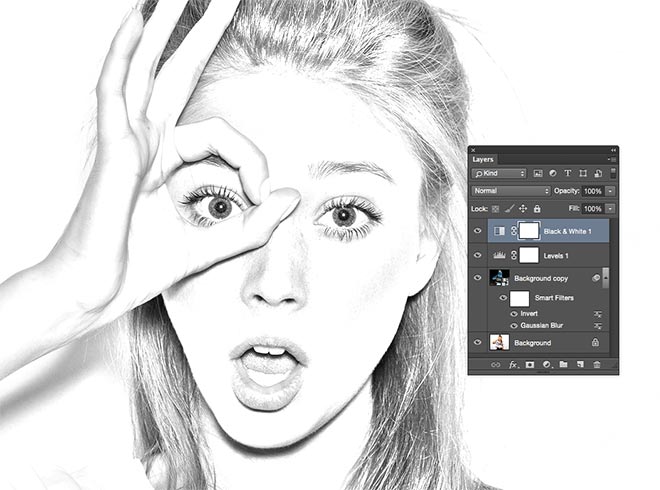
I want to create a couple of edits for my work that are different to the rest. They will allow me to experiment with new editing techniques and learn new skills on Photoshop. My first idea is to create a pencil sketch edit of a photograph. This will look like someone has actually sketched the photo rather than it looking like a photograph. The best theme to do this with is fashion. This is because these shots are, effectively, portrait shots. Of course, a lot of the time, portraits are sketched with a pencil. If I want my edit to look as realistic as possible, then a portrait shot is the best way for me to achieve this.

To actually edit the photo, I will need to follow a tutorial online. This is so that I can see, step-by-step, how to complete the edit and get the final pencil sketch photo. While going through the tutorial, I will pick up and learn new techniques that I will be able to use in future edits.

Image result for pencil sketch photoshop edit

Another edit I want to do is a retro edit. For this, I will again need to find a tutorial to follow online so that I can learn new techniques myself. I wanted to do a retro edit because of the history involved in the Royal Albert Docks. This site was created in the 19th century and has been used, in some form or another, since. Such a historic site is the reason that I decided this would be the best photo to use for my retro photo edit. This edit will make the photograph look as though it was taken using an old camera by using a sepia filter (applied in post-production). This edit will allow me to learn new techniques about how to apply filters and also how to make something more realistic. The edit won’t just apply a retro filter, but also edit the photo to add age to it.


References

Albertdock.com. (2019). History – Royal Albert Dock Liverpool. [online] Available at: https://albertdock.com/history [Accessed 30 Apr. 2019].

Spoon Graphics. (2019). How To Create a Realistic Pencil Sketch Effect in Photoshop. [online] Available at: https://blog.spoongraphics.co.uk/tutorials/how-to-create-a-realistic-pencil-sketch-effect-in-photoshop [Accessed 30 Apr. 2019].

Architecture Theme Technical Skills

Architectural shots, it could be argued, are easier to take. The building, of course, doesn’t move, which makes photographing it easier than most things. This suggests that the main thing to focus on would be the composition and framing. Of course, the camera settings are still important so that the final image will look its best. I found a page named ‘Photographing Buildings Using Your Digital SLR’. This page explains that shooting with an aperture of around f/11-f/16 would be best to create the desired depth of field.

Screen Shot 2019-04-05 at 13.11.47.png

It also suggests having the ISO setting somewhere between 100-400. Of course, all these settings are subject to the conditions and lighting on the day. Playing around with the settings and seeing what gives the best image on the day is the only real way to decide.

For my own photography, and with my practise shots, I focussed on framing and the composition of the photo. This practise shot below shows how I can improve my work. In this shot I decided to shoot in landscape, whereas (in hindsight) it probably would’ve been more appropriate to shoot in portrait. This is because of the long lines leading up through the center of the photo, and the top of the window and the columns that have been cut off.

P1020847 (2).JPG

Even in my practise shots, I wanted to refer back to my original research, particularly regarding leading lines. In this shot, I tried to capture the lines leading up vertically through the shot, leading up parallel to the bright, colourful window. In hindsight, it wasn’t a good idea to shoot this shot landscape, as I couldn’t fully capture the leading lines and didn’t capture the full beauty of the window and cathedral as a whole. Fortunately, this was only a practise shot and I can learn from my mistakes, so for my final shot I will make sure to shoot in portrait for this window shot.

References

dummies. (2019). Photographing Buildings Using Your Digital SLR – dummies. [online] Available at: https://www.dummies.com/photography/digital-photography/shooting/photographing-buildings-using-your-digital-slr/ [Accessed 5 Apr. 2019].

Fashion Theme Technical Skills

For Fashion photography, there are many tips and tricks that can be applied to most photography in general. Of course, there are still some aspects that are specific to fashion photography and portraiture. The rule of thirds, telling a story and trying different angles are all important things to bear in mind when taking any photos, but can be more important for fashion/portrait photography.

First and foremost, the ISO should be as low as possible (around 100, or any lower if possible). The aperture then needs to be around f/1.4., ‘Digital Photography School’ suggests. This is if you want a sharp image of the subject but with the background out of focus. It also recommends that, when trying to get a sharper image, using an aperture 2 or 3 stops above the camera’s minimum aperture will give the best result. The shutter speed is also recommended to be double the focal length of the camera’s lens. This can be less if a tripod is being used or if there’s in-camera stabilisation.

These camera settings will all be applied to my fashion photography to get the best results. I will need to set the camera to manual to set these settings and get the best possible end result.

The equipment for fashion photography can differ to that of other types of photography. For example, with night time photography a tripod is essential to achieve a clear photograph without any blurriness. For fashion photography, however, a tripod isn’t necessary because of the quick shutter speed. This means that there isn’t much chance of blurriness in the photos because there isn’t much time for the light to reach the lens.

References

Verzosa, C. and >, M. (2019). 10 Composition Tips For Better Fashion Photography. [online] ExpertPhotography. Available at: https://expertphotography.com/10-composition-tips-for-better-fashion-photography/ [Accessed 2 Apr. 2019].

Digital Photography School. (2019). The Best Camera Settings for Portrait Photography. [online] Available at: https://digital-photography-school.com/best-camera-settings-portrait-photography/ [Accessed 5 Apr. 2019].

Night Time Theme Technical Skills

Shooting at night time requires different camera settings. This is because, particularly at night, the lighting alters a drastic amount. When in manual on a DSLR, the settings need to be right so that the right amount of light is let in and the end result is as desired. According to the site ‘Improve Photography’, the best manual settings to choose for shooting in the dark are:

  • aperture – as low as possible
  • shutter speed – 10 seconds
  • ISO – 1600

These settings are best for shooting at night, according to the site. The lower the aperture, the more light that is let in. This is essential for night time shooting, so that none of the images are too dark. Ten seconds shutter speed is a good place to begin, but the website recommends that it may need changing as you begin to take photos and become familiar with the effects of the settings and the current lighting. The ISO being 1600 is best for getting a properly exposed photograph, and can sometimes be a bit of a compromise, when related to the exposure triangle.

For one of my photos, I want to take a photo of cars driving on a motorway, with their headlights showing up in the image like a light trail.

Screen Shot 2019-04-02 at 14.07.11.png

The settings for this will need to be right, because when just shooting on automatic, it’s impossible to get a shot like this: the shutter speed must be altered. The first and possibly most important part to getting a shot like this is to have a tripod. The camera needs to stay as still as possible so that there is no interference that would harm the image.

After looking at photography sites such as ‘digitalrev’ and ‘expertphotography’, I have learnt that to take these kind of photos the camera settings must be perfect. The shots must be shot in RAW, have a low as possible ISO, a medium/high aperture, and use a shutter speed of about 15-30 seconds. These settings all work together to create the best final image that will include the trail lights of the cars.

When shooting my own photo, I will make sure to use these specific settings so that I get the correct desired final image.


References

Improve Photography. (2019). Night Photography Camera Settings for Beginners. [online] Available at: https://improvephotography.com/44953/night-photography-settings/ [Accessed 2 Apr. 2019].

DigitalRev. (2019). {{header.title || ‘DigitalRev – Focus on photography’}}. [online] Available at: https://www.digitalrev.com/article/how-to-setup-your-camera-for-long-exposure-photography [Accessed 2 Apr. 2019].

Minoia, A. and >, M. (2019). How to Shoot Fantastic Light Trails for Maximum Effect. [online] ExpertPhotography. Available at: https://expertphotography.com/light-trails-photography/ [Accessed 2 Apr. 2019].

Reception Theory

Reception theory is the theory that all media has codes and messages, originally decided and encoded by the producer and then decoded by the audience. Stuart Hall, Jamaican scholar and theorist, states that there are three different types of readings that audiences choose to interpret media.

Screen Shot 2019-03-29 at 12.35.58.png

Dominant, or Preferred reading – how the producer wants the audience to view the media text. This is often if they find the text relatable and identify similarly with the themes and/or messages in the film.

Oppositional reading – when the audience disagrees  and rejects the preferred reading, or how the producer wants the text to be interpreted, and instead creates their own meaning of the text. This is more often when the topics are controversial and the audience may disagree with parts of it. Oppositional reading also happens when the audience member has different beliefs or is a different age or culture.

Negotiated reading – a compromise between the preferred reading and dominant reading, where the audience agrees with parts of the producer’s views but also has personal views and opinions on the piece of work. This happens when there’s a mix of what is mentioned above, for example the audience understands and agrees with the message but is of a different age and/or culture.

This applies to my work because I, as the producer of these images, need to decide on the messages that will be coded in the photographs. It is up to me to decide how I would like the audience to view my photos and how the message is portrayed. For me, through my fashion photography, the message will predominantly lie within the subject. Their pose, attitude, clothing and facial expression all create an idea of the subject for the audience.

For my architecture theme, the most essential part will be the framing. For me to show the beauty in these structures, and the effort and work done to create them, it will have to be done by showing them in the best (figurative) light. The framing, composition, and camera settings will all have to be perfect for me to give to justice to the architectural structures.

For my night time theme, again choosing the right camera settings will be of paramount importance. This is so that the final image is aesthetically pleasing – which I feel, for this theme, is the most important aspect. This will mean focussing particularly on the exposure triangle and having the right settings selected.


References

Hsu, H., Preston, D., Clarke, E., Hessler, P., Frere-Jones, S., Kolbert, E., Hsu, H. and Hsu, H. (2019). Stuart Hall and the Rise of Cultural Studies. [online] The New Yorker. Available at: https://www.newyorker.com/books/page-turner/stuart-hall-and-the-rise-of-cultural-studies [Accessed 29 Mar. 2019].

Revisionworld.com. (2019). Reception Theory – Media Studies – Revision World. [online] Available at: https://revisionworld.com/a2-level-level-revision/media-studies-level-revision/reception-theory [Accessed 29 Mar. 2019].

Lloyd Pursall

Lloyd Pursall is a photographer that has worked with the likes of Asos and Nike. He also often takes rather candid photos of subjects for his own portfolio. I have decided to look at his work because I think the aim of his photography is similar to mine: to show an honest perception of someone, through their decisions and choices, such as (in my case) their everyday clothing and fashion choices. His shots are all well thought-out and angles, pose, clothing and facial expressions are all important factors in his portrait shots, as these are the elements that (when combined together) give the viewer a clear impression of the model.

Screen Shot 2019-03-18 at 13.35.28

This photo is what inspired my own idea to have a photograph of my subject leaning on a car as a pose. The man in the photo above looks comfortable and confident sat on the car, suggesting that he doesn’t care about people’s opinions and thoughts on his behaviour. This translates to my own photography where I want to show, through my subjects’ clothing, attitude and pose, their disregard of others’ opinions of them self. My subject will be wearing a fur coat and sunglasses to further give the viewer a clear idea of her personality, particularly when paired with her sitting on the car with disregard for other’s opinions.

screen-shot-2019-03-29-at-10.41.33.png

This is another one of Lloyd Pursall’s photos that inspires me. The strong pose, mixed with the lens flare and bright sunlight behind the subject makes for an interesting photo. Strength and attitude are shown through the photo, and the sunlight being behind the subject’s head creates this idea of an almost God-like presence.

This photo again gives me ideas for my own photography. Experimenting with backlighting (particularly natural light) is a good way to add more attitude to a photograph and allow more of the subject’s personality to shine through.

For this photo, a wide aperture would’ve been used. This is so that the model is completely in focus and so that the backdrop is out of focus.

References

I-d. (2019). lloyd pursall photographs la’s cool kids, including moonlight’s ashton sanders. [online] Available at: https://i-d.vice.com/en_uk/article/a3kqq5/lloyd-pursall-photographs-las-cool-kids-including-moonlights-ashton-sanders [Accessed 29 Mar. 2019].

LLOYD PURSALL. (2019). LLOYD PURSALL. [online] Available at: http://www.lloydpursall.com/ [Accessed 29 Mar. 2019].

The Hollywood Reporter. (2019). Photographer Lloyd Pursall Captures L.A.’s Young Creatives. [online] Available at: https://www.hollywoodreporter.com/news/thursday-nights-exhibition-at-hubble-studio-celebrated-citys-renaissance-as-a-hub-artists-1044557 [Accessed 29 Mar. 2019].


Researching Websites

For my presentation, I also want to look at posting my work on a website. This site can be created and catered entirely for my own work, with various different pages for my different themes and explanations about my work. A website is a good way of presenting my work because I can create the whole site to look how I want, and it will be a place designed exactly for my own work. If someone wants to view my photography, the website will give clear and easy ways of allowing them to navigate through my themes and descriptions of my work.

To get ideas for how to create a good website, I looked on the ‘Susan Greene Copywriter’ website, where these fifteen tips are listed:

  1. Start with a clear navigation.
  2. Use conversational English.
  3. Apply SEO best practices in mind.
  4. Provide all the relevant information.
  5. Leave out the hype.
  6. Make your home page a to-the-point summary.
  7. Create unique landing pages for specific topics.
  8. Let pictures help tell your story.
  9. Include trust-building content.
  10. Keep your website up to date.
  11. Use a straightforward layout.
  12. Make it easy for visitors to contact you.
  13. Keep forms simple.
  14. Include a call to action on nearly every page.
  15. Make it perfect or as close to it as you can get.

She goes on to explain each point in more detail. The most helpful tip, I think, is to use clear navigation and conversational English. These are two points that I find to be things that I look for when entering a new website. If a website looks complicate, I will leave it immediately and instead use a different site. Furthermore, using conversational English is a good way to make the site seem informal and chatty to the person viewing the site. It can make the site seem more personal and, in turn, more engaging.

I also decided to look at some existing freelance photographer’s websites. This would allow me to get some clear inspiration and ideas about how to present this website. As the screenshot below shows, Terry McNamara’s photography site is very simple. It includes his name, a description of his work, and a bunch of sub-headings to that are all hyperlinked to allow the user to navigate the site easily. The colour scheme is simple, keeping the background black and all text white – this makes it easy to see and also easy to read the text. Terry’s website also follows number 12 of Susan Greene’s tips, by including contact details clearly. This is important particularly for freelance photographers, because their website will often be the way someone will find and contact them for potential future work.

TerryMc Photography


References

Susan Greene Copywriter. (2019). 15 Tips to Create Killer Website Content, Crisp Copy & Intuitive Design Are Best. [online] Available at: https://www.susangreenecopywriter.com/articles/15-tips-killer-content.html [Accessed 27 Mar. 2019].

TerryMc Photography – Manchester Commercial and Freelance Photographer. (2019). TerryMc Photography – Manchester Commercial and Freelance Photographer. [online] Available at: http://www.terrymcphotography.co.uk/ [Accessed 27 Mar. 2019].

Leading Lines

In photography there are many codes and conventions and techniques that can be applied. Today, I will be looking at leading lines and how these are useful in photography – in particular architecture and landscape photography.

Leading lines are lines in a photograph that lead the viewers’ eyes through the photograph to the main subject. The photograph below is a famous one that uses the lines of the train tracks to lead the viewer’s eyes to the horrifying sight of Auschwitz. This photograph is not only famous for capturing an eerie sense of what happens inside that building, but it also is a great example of leading lines. Train tracks (along with roads) are some of the more common examples and easiest ways of using leading lines. Moreover, leading lines not only lead the viewer’s eye to the centre point of the image, but they are also a good way of creating symmetry. This photo is almost perfectly symmetrical, which is appealing to the eye and, essentially, looks really good. The photo below also follows another important rule regarding leading lines: the lines begin in the foreground and lead the eye to the centre of the photograph. Connecting the foreground and background creates depth and gives context to the viewer.

In my Photography Ideas 3 blog, I talked about taking a shot of the Royal Liver Building in Liverpool and reflecting the size and grandness of this building. I will achieve this by using leading lines and taking the photograph from a low angle, looking up at the building. I will include some foreground so that the viewer can see the photograph from here, using the lines of the building to take their eye from the bottom of the photograph right to the top of the building. Another building that I know will include leading lines, is Preston Bus Station. The top of the building is, essentially, four parallel lines that will lead the viewers eye straight through the whole photograph. In my own photography, I will capture these lines at an angle that allow the viewer to investigate the whole image through using the leading lines. Personally, I find that leading lines work best in a black and white image. This is because it makes the viewer focus solely on the lines being used in the photograph rather than the colours involved. This is why, in post-production for my own photography, I will choose a photo with strong leading lines and make it black and white for my own edit.

Leading lines often don’t have to be perfectly symmetrical or parallel, however. As shown in the photograph below, some leading line photography doesn’t even include more than one line in the centre of the photo. This photo is successful because of its simplicity, but also the way the line of people draws the viewer’s eye from the right of the photo to the centre. The shadow below the people walking adds another layer of depth too. Furthermore, this photo supports my earlier statement – that leading line photography is very effective when, in post-production, put into black and white.

References

Digital Photography School. (2019). How to Use Leading Lines for Better Compositions. [online] Available at: https://digital-photography-school.com/how-to-use-leading-lines-for-better-compositions/ [Accessed 19 Mar. 2019].

Earth Trekkers. (2019). Auschwitz-Birkenau: How to Plan Your Visit. [online] Available at: https://www.earthtrekkers.com/auschwitz-birkenau-how-to-plan-your-visit/ [Accessed 19 Mar. 2019].

Place North West. (2019). Place North West | Preston Bus Station plans out next week. [online] Available at: https://www.placenorthwest.co.uk/news/preston-bus-station-plans-out-next-week/ [Accessed 19 Mar. 2019].

Ebiner, P. (2019). What are Leading Lines in Photography? – Video School Online. [online] Video School Online. Available at: https://www.videoschoolonline.com/leading-lines-photography/ [Accessed 19 Mar. 2019].

Primary Research – Manchester ‘Sixteen’ Exhibition

On Wednesday, I visited Home in Manchester to view an exhibition named, ‘Sixteen’. This exhibition including various portraits of sixteen year olds from around the UK. We decided this would be the perfect place for me to conduct primary research because I could also look at the photos being shown for inspiration for my own work, while also completing the questionnaire with people that are passionate about photography.

Disappointingly, the exhibition only included twelve photos. This meant that there weren’t many photos to take inspiration from, or many people viewing the exhibition, hence why the questionnaire only received twelve responses.

20190313_120421.jpg

Each of the twelve photographs included a short piece of writing from the subject in each image, describing their thoughts and feelings about being the age of 16 in today’s society.

The questionnaire still, however, is good primary research for my project and allowed me to get some feedback on important questions that I wanted to ask. I felt that this research could possibly be more valid than my other primary research, because this research asks people that are already visiting an exhibition, so clearly have an active interest in photography.

Screen Shot 2019-03-18 at 12.18.36.png

The style of photography that most people are interested in are landscape, portraiture and sports photography. These three styles, as the graph above shows, were the joint most popular. I then asked how often they visit exhibitions, and if they would be interested in attending an exhibition showing the daily fashion choices of teenagers. 50% of the public said they would attend, while 16.7% said maybe and the rest said no. To allow me to compare results to my first questionnaire, I again asked respondents if they follow any professional photography accounts on social media. The results were exactly 50/50. This could possibly be a reflection of the difference in ages between the people I asked in the first questionnaire and this second one. However, in both questionnaires, at least 50% of people said they follow a professional photography account on social media. Online would, therefore, be the perfect place for me to upload my photos to gain feedback, because evidently there is an audience for photography online.

Screen Shot 2019-03-18 at 12.42.23.png


References

Creative Tourist. (2019). Sixteen – around Manchester – Creative Tourist. [online] Available at: https://www.creativetourist.com/event/sixteen-around-manchester/ [Accessed 15 Mar. 2019].

Practical Skills

Rule of Thirds

Essentially, the rule of thirds is the way a photographer will break down a photograph. Placing the subject of the photo, or an interesting point of the photo, to the side along one of the lines makes the photo more interesting than just having the subject in the middle of the frame.

Screen Shot 2019-03-12 at 13.26.19.png

However, it isn’t always vital to have an image that obeys the rule of thirds. It’s best broken when symmetry is involved. A symmetrical photo, where the subject is dead centre, works perfectly even when ignoring the rule of thirds.

screen-shot-2019-03-12-at-13.38.03.png

Exposure Triangle

The exposure triangle a way of explaining how shutter speed, ISO, and aperture all interact with each other and change depending on each other. To achieve the right exposure, each three of these must be balanced. As the image below shows, the higher the aperture number, the less light is let in to the lens because of the hole being smaller. Having a higher aperture means that less light will be let through, ultimately meaning that there is greater depth of field and allowing more of a scene to be in focus. If there is a low aperture number, more light will be let in and the subject will look more isolated.

Screen Shot 2019-03-12 at 14.04.17.png

Shutter speed measures how long the shutter stays open, allowing more or less light in. The shorter the shutter speed, the sharper the image is, in most cases. In my case with my fashion photography, my model may be static or or may be moving. If they are moving, then I will need to have a fast shutter speed so that they aren’t blurred.

ISO being increased means that there is more “noise” in the image. Having a lower ISO is best because it means less “noise” intruding the image. However, having it too low means sacrificing sharpness.

In conclusion, having a low aperture f/number and a shutter speed as quick as possible would get the best results for portraiture (to blur out the backdrop and to keep the image sharp), but there needs to be compromise with the ISO to keep the image’s top quality.

In my practise shots, I applied the rule of thirds:

P1020817.JPG

As you can see in the above shot, I chose not to include the building in the center of the photo, but instead place it on the left vertical line of the thirds grid. Essentially, using this technique makes the photo more appealing because of the building being to the side, rather than it being dead in the center. It means that the viewer can focus on the photo as a whole rather than just the subject of the photo. I also practised using aperture with the photo below. Using a wide aperture meant that the focus is entirely on the subject of the photo, and the background is out of focus. Having an effective backdrop, while using a wide aperture, is an effective way of communicating through photography. For my actual shots, I want to have a street backdrop. This will add to the attitude and sass shown by my subject, supported by her fashion choices. All of these combined together is what will give the viewer a rounded impression of the model and the photograph as a whole.

P1020821


References

Digital Photography School. (2019). Rule of Thirds in Photography. [online] Available at: https://digital-photography-school.com/rule-of-thirds/ [Accessed 12 Mar. 2019].

B&H Explora. (2019). Who Wrote the Rule of Thirds?. [online] Available at: https://www.bhphotovideo.com/explora/photography/tips-and-solutions/who-wrote-rule-thirds%3F [Accessed 12 Mar. 2019].

Cooke, A. (2019). The Exposure Triangle: Understanding How Aperture, Shutter Speed, and ISO Work Together. [online] Fstoppers. Available at: https://fstoppers.com/education/exposure-triangle-understanding-how-aperture-shutter-speed-and-iso-work-together-72878 [Accessed 12 Mar. 2019].

Photography Life. (2019). The Exposure Triangle – A Beginner’s Guide. [online] Available at: https://photographylife.com/what-is-exposure-triangle [Accessed 12 Mar. 2019].

Siegel, E. (2008). Fashion photography course. Hauppauge, N.Y.: Barron’s.

P1020817.JPG